The Building
Built in 1946, our building is a classic example of the art deco buildings of the era in New York City. It was designed by architect Philip Birnbaum, who went on in his later years to design hundreds of New York high rises, including Lincoln Center Plaza. Birnbaum was an architect best known for his interiors. Developers applauded his economical use of space. But, inspired by a British urban planning ethos called the Garden City movement, he packed a whole lot of light and air into his designs.Having grown up poor in New York City, Birnbaum brought an appreciation for small-space living and public vs. private spaces to his work, resulting in very congenial floor plans.
I love the interior architecture of our home, but I have to say that I quite like the exterior of our building, too, with its compact scale, minimalist marquee entry, and open balconies (despite some of the clumsy enclosures.)
 |
For Mr. Renov8or a major attraction was the underground parking garage, and I've grown to appreciate that too, especially on summer weekends driving back from the North Fork. To swoop right into the "bat cave," unload bags, pets, and gear, and cart it all up the elevator in one fell swoop rather than spend hours circling the neighborhood looking for parking late on a Sunday night, as we used to in Brooklyn, is very hospitable.
Now, let's have a look inside.
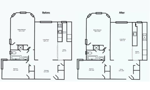
Original Floor Plan
Do you believe a person could fall in love at first sight with a floor plan? I did with this one. Grainy photos of rooms in "estate condition" didn't do it justice. I saw symmetry and proportion—and underutilized space in the entryway that we could use as a dining room, which would allow me to open the cramped galley kitchen. I didn't even need to see this home in person to know it was The One. When I did finally walk though it with the real estate agent, it only confirmed my first impression.
Post-Renovation Floor Plan
Entry
The original floor plan had a formal entryway. It seems quaint today that a developer would give over square footage to nothing more useful than a place to get one's bearings upon entering a home, and it's rarely ever seen in newer constructions. The foyer was a hallmark of mid-century home design, and it's a common element in this building as well as in most buildings in this neighborhood.
Kitchen
One of the charms of this home was a galley kitchen with adjacent dining area, both set apart on a raised platform. There's something to be said for the elevation. In a small home, it creates a sense of separation. I appreciate this openness and the graceful transition between rooms. When I designed the new kitchen, I kept the raised platform, as a nod to the era of the home.
Though my first instinct was to remove all the walls surrounding the old galley kitchen, in the end I kept a portion because it contained gas and water risers. Having lived with the partial wall a while, I'm happy for the separation—and place to hang artwork. Here's a look at the before and after photos of the kitchen if you're interested in what the original galley kitchen looked like.
Living Room
The living room is long and narrow, so I broke it up into two zones—a conversation area, defined by facing sofas, and a reading nook separated by a library table and two inviting lounge chairs.
Master Bedroom
Most our windows face east, so they get bright early-morning light.
The bay windows overlook a neighborhood of two-story Tudor homes, so up here on the top floor of our building there is nothing impeding the light. It can be a challenge to find window treatments for narrow side windows of a bay. I hacked some IKEA solar shades. See IKEA Hack: Cutting Enje Roller Blinds to Fit Your Windows. And those are IKEA window treatments for a bay window as well.
Second Bedroom
It's a luxury in this city to have an extra room. We use the second bedroom as an office/media room, and I installed a pull-down wall bed for the occasional guest.
Bathroom
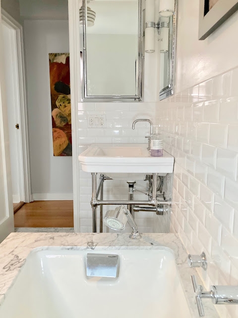
A console sink and marble-clad deep-soaking tub seem as if they might always have been here.
If you're curious as to how marble holds up in a bathroom, see My Honed Marble Six Years Later.
The shower tile, in contrast, is a deep charcoal gray with light gray grout, to pick up a color in the floor tile and the veining in the statuary marble.
The shower door is vintage—one of the few original elements that former owners left intact. It was manufactured in 1946 by GM Ketcham MFG Corp in Brooklyn. The chrome cleaned up nicely with a bit of elbow grease and Bar Keeper's Friend. I had the door reglazed with clear glass and left it open at the top where we had raised the ceiling in the shower. I can't tell you how many contractors tried to tell me this door wasn't worth salvaging. It's one of my favorite elements in this bathroom
Sourcing the sink produced a happy surprise. An ordinary pedestal sink would have been perfectly appropriate to the period and was very likely what was here originally, before the previous owners did their sad remuddling, but luxe homes of the period would have had an art deco console like this, with sparkling chrome legs.
Sourcing a console at the time I was designing the bathroom was a challenge. There's always the custom route by sites like sinklegs.com. And I did give very serious consideration to the Kohler Kathryn, with its beautiful marble top. The price tag on that gave me sticker shock, plus I worried it might be marble overkill and detract from the focal point of the tub. So I took a chance on this porcelain model—the Mason Console Sink from Signature Hardware, an online store that has no bricks-and-mortar location where you can see and touch the products.
Buying a sink sight unseen was a leap of faith, but one that paid off. It is a good match with the Kohler fixtures and has exactly the timeless look I was going for—at a third the price.
The chrome medicine cabinets and sconces are from Restoration Hardware, and the quality and heft could not be better. RH's white glove delivery was excellent. I opted for two, his and hers, for the symmetry as well as the extra storage.
This concludes our house tour and details of the renovation so far. I hope you enjoyed it!


Um, WOW! Looks truly fantastic, Sally! Bravo!!
ReplyDeleteThanks, Margaret! I have enjoyed it. Even the stressful times -- like when the first tub arrived chipped. :-/
ReplyDeleteIt looks fabulous, Sally. I see all the mirrors and artwork have been hung. I hope you two are enjoying all that room. Mom
ReplyDeleteMom, we are loving it! We just got our parking space. We are quickly acclimating to the new luxuries of ample space and building amenities. No turning back! We are spoiled,
DeleteAmazing but I'd expect nothing less! I love that big comfy chair and ottoman in the living room -- where are those from?
ReplyDeleteSo, back when we purchased these pieces, Mary and I were room mates just out of college. We bought them together -- two sofas, a chair and ottoman. When we each bought our own place, we split the furniture. She had a bigger livingroom so she housed the chair and ottoman. Fast forward a decade or so and i,moved to a bigger place just as she was changing her decor. I sent her a giant painting. She sent me the chair, ottoman, and library table. We have revolving furnishings it seems!
DeleteLovely Sally! It looks terrific, love your sofa, dining area and bathroom and shelves!! It's all fab, nicely done.
ReplyDeleteAllen! Thanks so much! When will you come and see it? Pick a day. I'd love to see you.
DeleteGorgeous! Just moved into a unit with a similar layout. Finding plenty of inspiration in your posts, including the ingenious wall of bookshelves. Great job!
ReplyDeleteHi Kate, sorry I missed your comment. I seem to have missed quite a few on this post. Thanks so much! Did you do a Billy built in? I'd love to see pics!
Deletewhere did you get that yellow dresser? love it!
ReplyDeleteHi Stephanie! How did your move go? Ours was grueling -- but no bad surprises. Just a lot of hard work pacing and unpacking.
ReplyDeleteThis dresser was a street find. With a twist. While living on Clinton street in Carroll Gardens, I came across it a few block away. My room mate and I hauled it down the street and down a flight of stairs nearly crushing ourselves beneat it's weight. I later bought the apartment that I found it in front of -- my first purchase. So I like to say it found me. I replaced the rather ornate handles with milk glass knobs. I very had it for about 15 years. The markings say Thomasville.