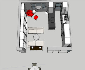
Inspired by that recycled kitchen I've been stalking on Green Demolitions, I started to reimagine what our home will look like if I open the wall between the kitchen and living room. I mean really look like. Will the living room feel cramped? Can the dining table be relocated to what's now the entry foyer? Will it all flow? This is a job for Sketchup!
If you're interested in using Sketchup, there are many YouTube tutorials to get you up and running quickly. One by SketchThis.Net shows how to get your walls up and turn your room 3D in just 6 minutes. Another series by JimboVids demonstrates how to quickly draw cabinets and replicate them. The cabinets in the video are very detailed, with inset and raised panels in the doors. I prefer modern door fronts for my kitchen, so I was able to fast-forward through a lot of that. The only components that I downloaded from the free Sketchup warehouse were windows, appliances and furniture — and that part is waaaay fun. It's like shopping, without spending any money. "Come to Mama, red Womb chair!"
Seeing my dream kitchen in 3D helped me realize a few things. Opening our kitchen clearly solves several functionality problems. For one, I was able to widen the aisle to the acceptable minimum of 36". Second, I was able to separate the cooktop and wall ovens — and that's big. Our current range oven has just enough room for me to open the door. I can't stand in front of it and bring trays in and out; I have to stand to the side. This can feel a bit trepidatious when it's a heavy Dutch oven or searing hot roasting pan that I'm lifting out. The open concept also provides the ability to locate the refrigerator in a place where everyone has access to it while I'm cooking — probably the biggest blocker in our current one-cook kitchen. And of course, the island does open things up, so that I can talk with people while I'm cooking.
Things that I'm not able to address yet because they are still big question marks are how much of the wall will have to remain. In my sketch I kept up a good portion of it, so that I could see, worst case, how it would look. It would be great if I could reduce even more of the wall. Ideally, I'd like to have an entrance to the kitchen aisle at either end. But I'm unsure exactly where the mechanicals are right now. We'll have to adjust our plan when we open the wall and see exactly what we're dealing with. Second, I didn't even attempt to address the floor in my drawing. Eliminating the current raised platform the kitchen is on is very likely necessary. I'm strangely hesitant to eliminate this quirky midcentury architectural detail. Is it possible that I could keep the platform? With the kitchen aisle expanding, it would be tricky. I'd have the island half-on, half-off — building the platform up a few inches on the living room side, and that might look odd. It definitely would break up the flow in the room. And continue to be a tripping hazard, as it is now. I'll have to mull it over.
What do you think? Please share your thoughts in comments.


No comments:
Post a Comment