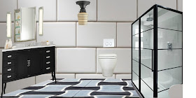
One of the first things I like to do when I'm designing a bathroom is bring all of the elements into Pixlr as layers and move them around without worrying a lot about distortion and proportion. It's fun, and it's often surprising what I discover. Take the black and white bath we're working on...
In my mind's eye, I had been favoring the basketweave floor with the hint of blue-gray and picturing a white shaker vanity with a Carrera marble top to pick up the gray.
But once I brought the elements together, I could see right off the bat that the vanity wasn't working the way I thought it would. The black frame of the shower enclosure was so strong in the right corner that it was calling for something equally as strong to anchor the left corner.
The Pharmacy vanity from Restoration Hardware has nice splayed legs that reveal a lot floor beneath them. I always like that in a small room. Seeing some floor beneath the furnishings gives the room an airiness, and it's especially effective when you've got a gorgeous floor. In addition, the black coated steel of the Pharmacy vanity was more in tune with the black framed enclosure. The design was starting to get somewhere, but now my mirror, sconces and ceiling light were waaaay off.
I felt like the whole room was becoming very angular, so I decided to try some round light fixtures and a mirror that has a more decorative beaded finish. Now we were talking! But guess what, I now did not like the floor. The round light fixtures were calling for something a bit more curvy. Do you recall our tile samples from last post:
#1 and #3 have some nice curves. I plopped in #1 and voila!
Now we're getting somewhere! This is only a first draft, but I like where it's heading.


No comments:
Post a Comment