Is it worthwhile spending money to upgrade a rental?
For two years before we bought our current home, we lived in a cute cottage in Sunnyside Gardens. It was a rental - Ross had been living there 14 years before we met. Our landlady, a lovely woman who lived in the cottage across the path, was born and raised there. Like almost all of the buildings in the neighborhood, it was a 3-family residence - two up and one down, as they say. Generally, owners lived in the two-bedroom units on the ground floor while the one-bedrooms above them provided rental income. The neighborhood was booming, with the cottages increasingly being converted to one-family homes.
Sunnyside is a charming neighborhood in NYC, about a 20-minute train ride into Manhattan. Sunnyside Gardens is the historic district within Sunnyside, comprised of about 8 blocks of two-story cottages that share common gardens - building plans in the 1930s were influenced by the English Garden style architecture in Britain of the same period.
Our apartment was charming, as well - in a crumbly sort of fashion. Built in the 1930s, it boasted some Craftsmen era design elements, including bay windows, hardwood floors, plentiful wood molding, solid panel doors, brass door knobs, and the like. What was not so charming was our kitchen.
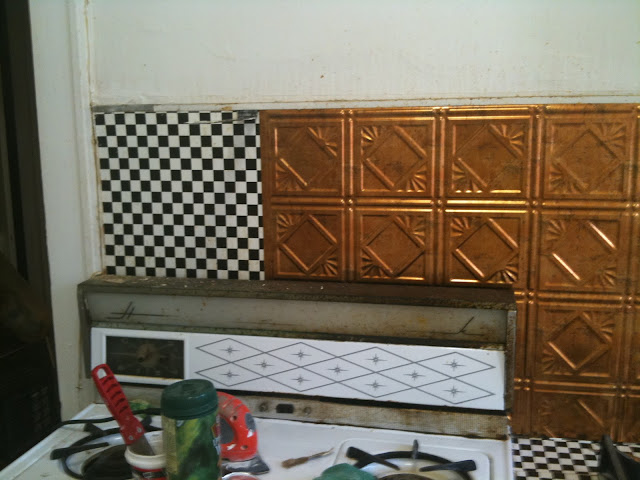 |
| My only "before" while I was covering over the checkerboard backsplash |
Though there was room for a full galley kitchen, very little of the space was being utilized at the time. A previous renter had papered a checkerboard backsplash and a tiny slice of counter between the range and sink. And that was it for counter space! About 12" to prep your food on.
The opposite wall had one wall cabinet and a pantry - original built-ins that surrounded the refrigerator. There was one other wall cabinet - a metal one over the sink. And that was it for storage space! Two cabinets and an 18" pantry.
A large blank space to the left of the fridge had likely been furnished for many generations with a small chrome and vinyl kitchen table and two chairs - you know the kind. I figured at the very least, I could utilize that space to add some base cabinets and a butcher block counter and give us more storage and prep space.
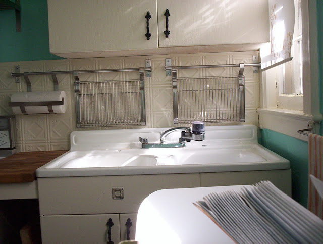
As I started to plan it out, I could see that this kitchen had potential. The Youngstown double sink was in good condition.
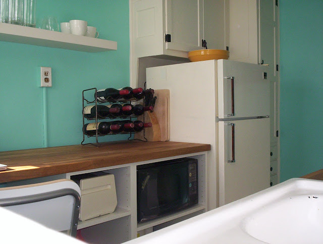
And the built-in pantry and fridge surround just needed a good coat of paint. Appliances were circa 1970 but functional.
I knew that with a little bit of work and not a lot of money I could make this kitchen look great. I headed to Ikea Brooklyn to see what I could scrounge from their "As Is" department, where they sell their markdowns. And I got lucky! It was a Tuesday afternoon, no one was shopping, and the staff were just bringing down a lot of mark-downs, as the designers were remodeling all the kitchen display rooms. I hit the jackpot, scoring an 8 foot stretch of butcher block (Numerar) counter top for $80 and two base cabinets for $22 each.
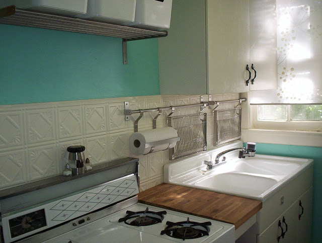
I only needed a 6-foot counter for our kitchen, so I was able to salvage some remnant butcher block to replace the checkerboard counter piece between stove and sink. And that helped give the kitchen a unified look.
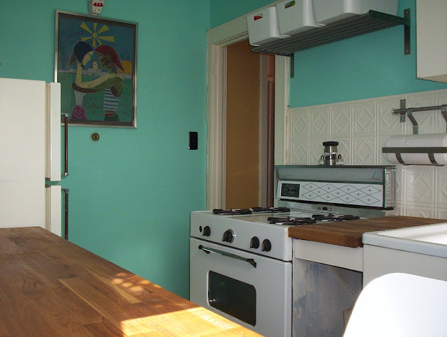
I installed a new backsplash right over the old checkerboard papered one by affixing faux tin ceiling tiles with adhesive. I painted the new backsplash to match the cabinets. Above the range, I installed a metal Ikea Grundtal rack to hold bins for spices and cooking supplies. Also from the Grundtal line, I installed two hanging dish racks and a paper towel holder above the sink.
Two Ikea Lack Floating shelves gave us some open storage above the countertop.
I painted the built-ins a hi-gloss creamy white, called Cottage White, from Home Depot's Behr paint line. And I am in love with this paint for retro kitchens! It goes on like cake batter. For the walls, I had the Home Depot paint department color-match a Tiffany jewelry box, to get exactly the timeless turquoise I wanted. Hinges and hardware in the kitchen were all a mis-match - some chrome, some gold, most of them painted over white by previous renters. All different styles and different eras. I didn't even try to strip them. I just spray painted them all black to give them a unified look.
The new base cabinets were not going to match the original built-ins no matter what I did, so I didn't bother with doors but left them open for storing small appliances.
And I left a good stretch of countertop open-span to accommodate a stool, where I set up a small desk area.
I also scored a roll of sheer white window fabric in the As-Is department at Ikea and made these cheerful window treatments.
For a spend of about $350, we gained enough storage and counter space for comfortably prepping meals. This kitchen turned out to be one of the most accessible kitchens I've ever cooked in - everything was literally at my fingertips. We had some memorable meals in that cottage.
In addition, I always felt the kitchen looked like it belonged to the era of the cottage, with it's cheerful turquoise walls and "cake batter" cabinets and trim.
Product list:
Wall paint: Behr Interior Eggshell, Base, $26 a gallon + $6 custom blend (to match Tiffany box turquoise)
Trim paint, Behr Interior Hi-Gloss, Cottage White, $29.98 a gallon
Countertop, Ikea Numerar, $80 (As Is department) - discontinued, so I linked you to similar Hammarp
Base cabinet frames, Ikea Akurum, $22 (As Is department) - discontinued, so I linked you to similar Sektion
Hanging dish racks, Ikea Grundtal, $26 each
Hanging rails, Ikea Grundtal, $7.99 and $9.99
Wall shelf, Ikea Grundtal, $19.99
Bins for storing spices, Ikea Pluggis, $9.99 each
Wall shelf, Ikea Grundtal, $19.99
Bins for storing spices, Ikea Pluggis, $9.99 each
Floating wall shelves, Ikea Lack, $14.99 each
Barstool, Ikea Franklin, $45
Window treatments, Ikea fabric, $3 a roll (As Is department)
Total: $345






No comments:
Post a Comment