
If you've been following our renovation, we've been stalled in the home stretch for some time, waiting on the lighting over the sink run and peninsula and the remaining doors that had to be reordered to measure after some field fitting around the wall oven, above the fridge, and to the right of the pantries.
Well, it's all in now. Let's have a look!

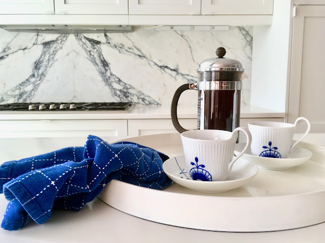
The simple backdrop of stark white shaker cabinets is the plain setting that by contrast lets this diamond shine. I'm just a tiny bit enamored with it. Mr. Renov8or is calling it "My Precious." (Do we have enough "Lord of the Ring" metaphors?)

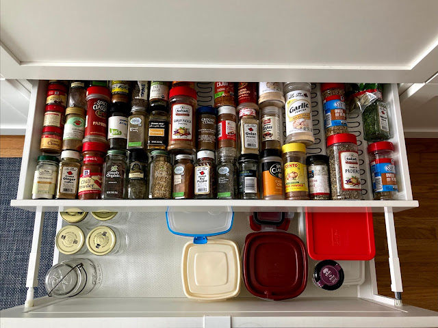
The decision to go with IKEA boxes with custom solid wood doors paid off. I love the internal organizers in the IKEA bases. Like this "hidden" drawer that I'm using for spices. It's so easy while cooking to just reach down and find at a glance the spice that I need.


I liked the way the dining platform looked, however the kitchen, even after a modest $3,000 (mostly white paint) glow up, was not very functional.


And I made sure the sink wasn't back-to-back with the range or other prep space, so two people could cook together.

The dining area was moved to what had been our foyer—a charming but underutilized space.


She was in a sad, sorry state, but you could still envision how beautiful the home could be with a little love.
On the sink run, I nixed wall cabinets. I didn't want to block the line of sight to the window. The brass picture rail was a last-minute addition—it ties in with the brass lights and sink fixtures, and it's always great to have a place to display art.

The decision to go with IKEA boxes with custom solid wood doors paid off. I love the internal organizers in the IKEA bases. Like this "hidden" drawer that I'm using for spices. It's so easy while cooking to just reach down and find at a glance the spice that I need.

One for flatware.
And two more located in the pull-out that houses our recycling station.

The walls separating the old galley kitchen from the dining area have come down. It lets in so much light.
The platform is all kitchen now.


Materials:
We annexed the old foyer to be the new dining area. I pulled the two rooms together with this floating marble-topped sideboard using the same IKEA bases as the kitchen. Just as with the kitchen, the shaker doors are custom, solid maple—and there is nothing "faux" about this marble-topped credenza.

- Flooring: Contractor restored and integrated new planks where needed.
- Sektion cabinet boxes, Variera internal organizers, and Nutid integrated wall microwave: IKEA
- Solid maple doors: Scherr’s
- Cabinet paint in Extra White, SW #7006: Sherwin Williams
- White edge cabinet pulls, #9898: Richelieu
- Integrated refrigerator, HC #2080: Liebherr
- Masterpiece gas cooktop, #SGSX365FS: Thermador
- Pull-out range hood, #CRIS36SS600: Faber
- Riverby 27” sink: Kohler
- Trinsic kitchen faucet: Delta
- Continental water filtration faucet, #KS8198CTL: Kingston Brass
- 30” electric wall oven, #VEBIEM301SS: Verona
- Undercounter freezer drawers, #SCFF532D: Summit Appliance
- Quartz countertops in Pure White, #1141: Caesarstone
- Italian Poannazzo marble backsplash: BAS Stone NYC
- Backsplash fabricator: ABF Marble
- Wall paint in Blackened, #2011: Farrow and Ball
- Boldmfg brass picture shelf; LongMadeCo cylinder drop spot mid-century minimal wall light: Etsy
The Designs
If you're now wondering what the kitchen looked like before, I went through old photos and rounded up a selection. They're not the best quality, because the old kitchen walls basically blocked out natural sunlight. But they'll give you an idea of how closed in it all looked.
But first, I'll remind you of my mood board and plans...


The "Befores"

The kitchen was, and remains, on a raised platform—which was a common architectural detail in mid-century homes in this area of New York. The kitchen was a small galley, also a common design of the era. It was separated by a narrow opening from the dining area, all on this dramatic raised platform.

I liked the way the dining platform looked, however the kitchen, even after a modest $3,000 (mostly white paint) glow up, was not very functional.

The aisle was, and remains, exceedingly narrow. If you opened the dishwasher, it blocked the fridge.

If you opened the oven to, say, take out your Thanksgiving turkey, you'd have to take it out from the side because there was no room to stand in front of the range with the door open.

When we moved in, I gave it a facelift by painting the cabinets white and adding an upper row of stacked cabinets and a subway tile backsplash.

Aesthetically, it got me through while we decided what to do about this kitchen.

Five years is a long time to think about a project, so by the time we pulled the trigger on this renovation I had a good idea of what I wanted.

My plan was to open up the walls and spread out, so that everything on the raised platform would be "kitchen."

This would give us space to move the refrigerator and pantry out into the open, where anyone could grab a drink or snack while someone's cooking.

I moved the cooking station to the back wall and positioned wall ovens in an area where I could stand in front when removing baked food.
And I made sure the sink wasn't back-to-back with the range or other prep space, so two people could cook together.

Before "the Befores"
So, now you have a good idea of how the place looked before we kicked off the renovation. But to truly see how far this kitchen has come, here are some before the "befores" — photos from the real estate listing when we purchased the house.


She was in a sad, sorry state, but you could still envision how beautiful the home could be with a little love.
To follow our Renovation Diary:

No comments:
Post a Comment